How to design a banner for your business in six easy steps


Think of your company's print banners like billboards—they need to quickly attract passersby and simultaneously convey your message. But in today's overcrowded advertising landscape, how do you design a banner that will stand out and entice your target audience?
Banner design is easier than you think, if you break down the process into small steps.
1. Determine where you’ll place your banner
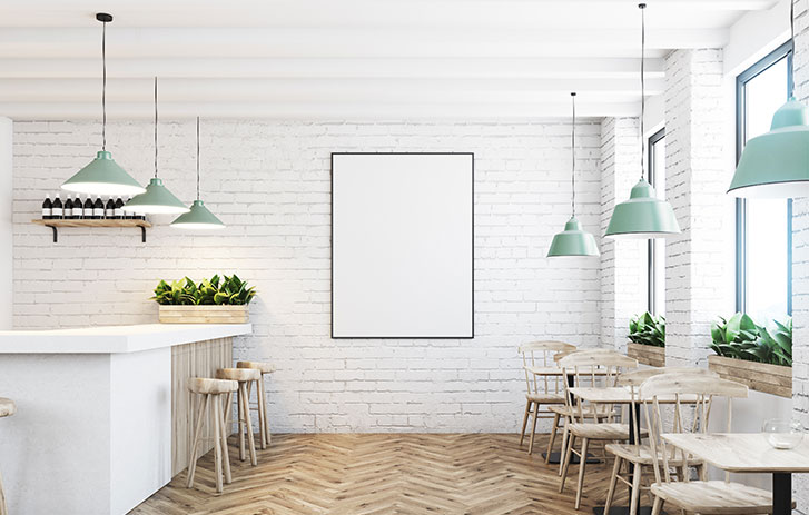
Will your banner be hung outside your storefront or indoors at a trade show booth? The placement of your banner should help inform your design, color, material and message. When choosing colors, think about if it will clash or blend in with the background. For example, don’t choose a red background if you’ll be hanging your banner against a red brick wall.
2. Define your message (and keep it succinct)
Take time to carefully consider your message. What action do you want people to take after seeing your banner? Now, how can you convey this message in as few words as possible?
Condense your message down to eight words or less. To be effective, the banner's message should get straight to the point. For example:
“We now offer free delivery”
“Grand Opening”
“25% off entire selection”
If the banner won't be set up at your business location, include your company's name and/or logo, making sure that they're easy to pick out from the text. You should also include either a phone number or website. If you have more to say, direct potential customers to where they may find more information – “see website for more details” or “inquire within.”
Do you have any previous marketing campaigns for your business? If so, go back and look for anything relevant (images, catchy slogans, color schemes) to pull from them. Connecting past marketing themes with your current campaign will help preserve brand recognition.
3. Select simple images or graphics
Your custom banner design's message may not require an image, but sometimes, a picture can be the main way of making your point. If you're using an image, make sure it's a simple one – and that it's obvious, from afar, what the image is. Images should have clean lines and few colors.
Feature images of the products or services you're promoting. For example, if you are introducing a delivery service, an image of a delivery truck on the move beside the text “Now offering free delivery” clearly emphasizes the message, without the viewer needing to remember your text. A passerby will think: Image of truck = delivery. This business now has delivery. Got it.


4. Choose your font style and size
A print banner targeted at pedestrians or drivers can't require time to study in detail. For your banner to be legible from afar, choose a font that is classic and clean.
To achieve a clean look, stick to one or two font styles. A mix of different typefaces can distract from the story.
If you use two fonts, make sure they’re in the same “font family.” For example, Arial Light, Arial Narrow, Arial Classic, and Arial Bold pair well together. Check out our online design tool to find out which fonts match up.
Consider readability when choosing font size. Even if people can walk up to your banner—whether it's a standing banner design at a trade show or a window banner in your store—the font size should still be large. Your banner could have the wittiest lines ever written, but if the font is too small, no one will be able to read it. You can use all caps to emphasize a specific word or if your text is short enough.
5. Create visual contrast
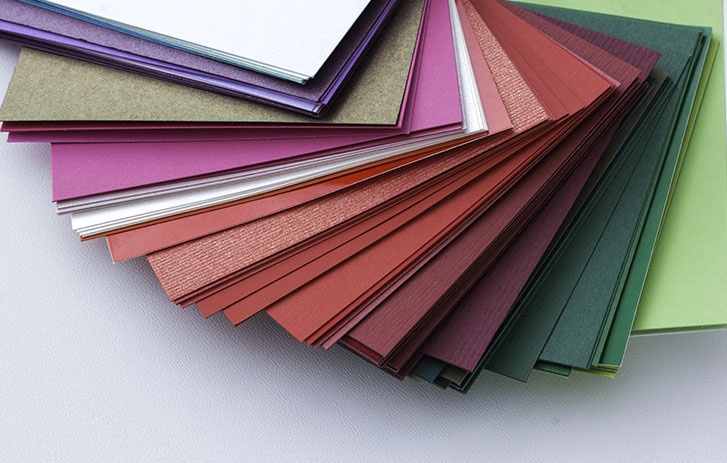
Someone jogging or driving by your storefront won't notice your banner unless it really stands out from its surroundings. While bright colors work to attract attention quickly, a contrast of colors will make your banner pop. Often, the best business banner ideas consist of just two colors that contrast well–one for the text and one for the background-like black words on a white background or white writing on a red background.
Try these combinations:
- A bold font that contrasts with an eye-catching background color, like red, yellow or orange
- Black text on a white background or vice versa – a classic combination
- Blocks of color (ideally in a color identifiable with your brand) with white text over it, creating a focal point
Have fun playing around with color combinations, but be sure that the text is still readable from at least ten feet away.
6. Focus on layout
Now comes the final piece of the puzzle: the layout. The best banner design ideas include an uncluttered layout with few images. Potential clients may glaze over a banner with a messy design that they can't instantly understand.
First, decide if your banner will be vertical or landscape. Use a landscape banner if you plan to hang it on a wall (interior or exterior) and it's intended for drivers and walkers.
- If you have only one line of text, center it and leave a border of white space on all four sides.
- For two lines (or more) of text, consider center alignment in the banner, also with a border of white space. Reduce the font size for the second line if that info is less important.
- Longer text is fine if the banner is inside a location where people have a chance to stop and read it.
For vertical banners, less text is better. One example: when a store has a sale, you might see vertical banners hanging from the ceiling that say nothing more than “SALE” in a white font over a red background.
Ready to get started? As you go through each step of the design process, use our design tool for inspiration. You'll soon have an attractive, professional banner for your business that's ready to print.
Related reading

How to make a banner for your business
Banner design for business marketing requires inspiration, a strong message and attractive visual content.
Read article
How to create a poster
Learn how to design your own poster with these tips to create a memorable, eye-catching business poster.
read more
Choosing types of paper for printing
To choose the best type of paper for printing your project, consider factors like finish, thickness and cardstock paper weight.
Read more